Mobile Technology: Week 2
Another week, another post! This week I’ve narrowed down my ideas down to two. I decided to alter them and further expand upon them by following a template provided by my lecturers (mock-ups included).
Babel Tower
- App Elevator Pitch: Build a tower that reaches the heavens and repel attacks from the armies of heaven.
- Deeper description of gameplay:
- Short-term goals: Successfully place a tower block during the building phase. Successfully repel angels during the defense phase.
- Long-term goal: Build the tallest tower and defend it for the longest time to reach a new high score.
- Difficulty scaling: Both gameplay phases have separate difficulty scaling. During the building phase, the blocks will move faster and faster after one is placed. God will also force them to be smaller over time by striking them with thunderbolts. The defense phase will start out with weaker angels and will progressively get harder the longer it goes on with stronger angels appearing.
- Breakdown of Inputs/UI: Placing blocks during the building phase will be done by well-timed tapping. Angels will be defeated by being tapped on in rapid succession instead. The UI consists of only the score and a hamburger menu which makes a settings menu appear.
- Discussion of Monetisation: Before the beginning of the game’s defense phase, the player could be offered a boost in power for watching an advert. This boost would make killing angels easier. Another advert can be shown once both phases are complete.
- Considering Scope/Roadblocks: The game should be fairly simple to prototype. The biggest roadblocks will be adequately explaining the controls and meshing the two phases of gameplay together in a way that feels natural.
- Gameplay Screen / UX:
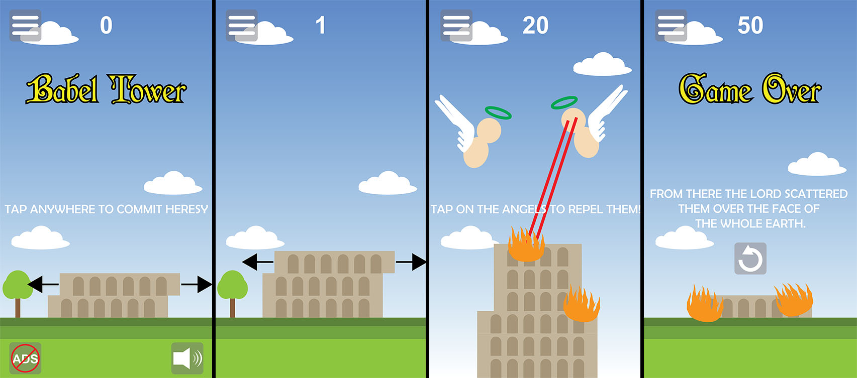 The above mock-ups show approximately how the game screen should look at various times. From left to right:
 - The first screen is the main menu from which the player can begin playing. It has a message informing the player about how to play (disappears after tapping), a button to remove ads via an in-app purchase, a button to control the volume and a hamburger menu with more options. The score is displayed at the top of the screen. The block moves from side to side (black arrows in the mock-up indicate this movement and would not be visible in-game).
- This is the first gameplay screen. It functions much the same as the main menu, but there aren’t as many UI elements.
- Once the player fails to place a block, the tower is considered finished. Gameplay shifts to the defense stage. Angels fly in and start frying up the tower. Pieces of the tower go up in flames until they crumble. The angels work their way fully down. The player has to click on them several times to repel their attacks (i.e. kill them). Their halos in the mock-up are green because I think they could be used as HP indicators for the angels.
- Game over screen. Shows a quote from the Bible and a button to start over. This takes the player back to the main menu screen.
Castle Climber
- App Elevator Pitch: Bounce from wall to wall to scale the dragon’s castle and rescue the princess!
- Deeper description of gameplay:
- Short-term goals: Avoid obstacles. Collect coins.
- Long-term goals: Climb as high as possible to reach the next level. Collect enough coins to unlock a new pallette swap for the main character.
- Difficulty scaling: Each level will be slightly longer. The climber’s speed will also slowly increase over time. New threats will appear over time as well + more frequently.
- Breakdown of Inputs/UI: Tapping on the screen will cause the climber to jump to the other wall. The UI will display a coin counter
- Discussion of Monetisation: An advertisement can be shown after a level is complete, but only after every third level or so (so that it doesn’t get annoying). The player will also be able to watch adverts to unlock certain costumes for the climber as well.
- Considering Scope/Roadblocks: This idea should be fairly simple to prototype. The biggest challenge will be to make jumping between walls feel good, but playtesting should help with that.
- Gameplay Screen / UX:
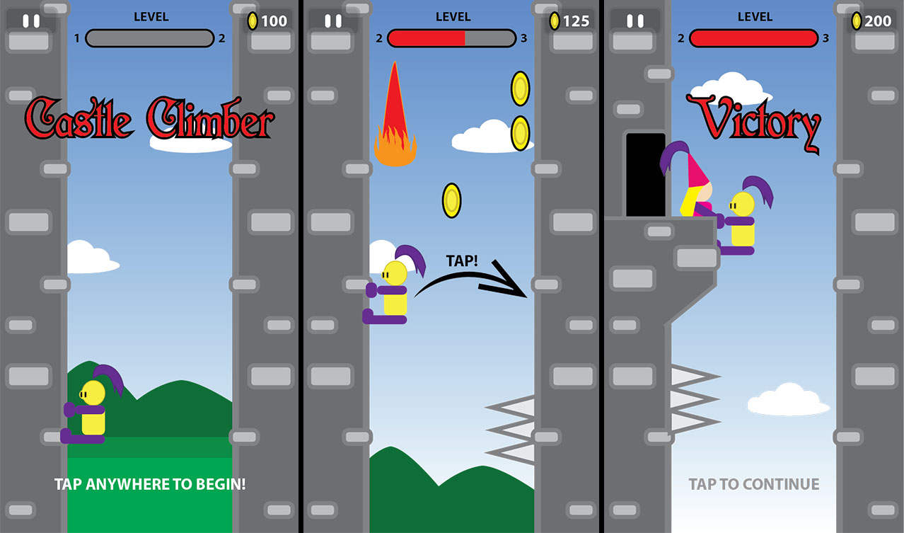 The above mock-ups show approximately how the game screen should look at various times. From left to right:
 - The main menu. HUD consists of a pause button (access to various options), a progress meter and a coin counter. An instruction at the bottom of the screen tells the player how to start playing.
- Gameplay screen. Same elements as before, except the logo and bottom text are missing. The player needs to tap to avoid dragon fire and to collect the coins as indicated by the black arrow.
- Victory screen. The player reaches the end of the level and rescues the princess. A text on the bottom encourages a tap to move on to the next stage. The game over screen would likely not be much different.
What do you think? Which idea should I start prototyping next week? Let me know in the comments!
Written on February 2, 2020 | Tagged: Mobile Technology in Computer Games